Pick a name people can say, spell and search
A good store name should sound like something a customer would say out loud at the taxi rank, in a WhatsApp voice note, or when pointing a neighbour to your link. Keep it short, plain and easy to remember. If people can spell it after hearing it once, you are already ahead. A long name with many words often gets shortened by customers anyway, and then the shorter version sticks whether you planned it or not.
For informal traders and home businesses, the best names are often direct. They tell people what you sell or where you are based. A name like that is easier to repeat and easier to type into a phone. It can also help when a customer is comparing a few shops and wants the one that looks the most organised. You do not need clever wording just to sound important.
- Keep it to one to three words where possible.
- Avoid unusual spelling that people will guess wrong.
- Use the same name on your banner, pricing page and WhatsApp profile.
- If you serve a specific area, you can include the place name, but keep it neat.
If you sell groceries, cooked meals, clothing or household items, the name can reflect that without being too narrow. The aim is clarity. A customer in Alexandra should know at a glance whether your shop sells daily essentials, school wear or home goods, and that starts with the name they see first.
Banner text should carry one clear message
Your banner is not the place to list everything you do. It should say the main thing, cleanly. The strongest banners usually carry the store name, a short line about what you sell, and maybe your delivery area if that helps buyers. Too much text makes the banner hard to read on a small screen, and most people will be looking at it on a phone anyway.
Think of the banner as the front board of a spaza shop. A person should be able to understand it in a few seconds. If the image is busy, the message gets lost. If the words are tiny, they might not show properly on mobile. A simple background, strong contrast and neat wording work better than a crowded picture with many colours and extra lines. Keep the message direct, not loud.
- Use large text that stays readable on mobile.
- Choose one main colour theme and stick to it.
- Leave enough space so the name does not sit on top of a cluttered image.
- Test the banner on a phone before you publish it.
In Durban, where humidity can make outdoor signage fade faster, a clear digital banner still needs to look sharp on the screen. The same applies in Cape Town, Pretoria and Gqeberha where customers may be checking your shop during a quick break. Clarity matters more than decoration.
Use a banner image that feels like your actual shop
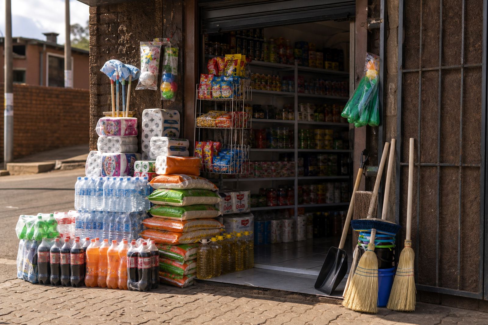
The best banner image usually shows the kind of business you run, not a random picture that looks pretty. If you sell food, a neat product shot or a basket of items can work well. If you sell clothing, use one clean image that shows folded stock or a well presented item. If you sell mixed goods, a tidy shelf or counter scene can still do the job. The point is to help a customer connect the image with what they can buy from you.
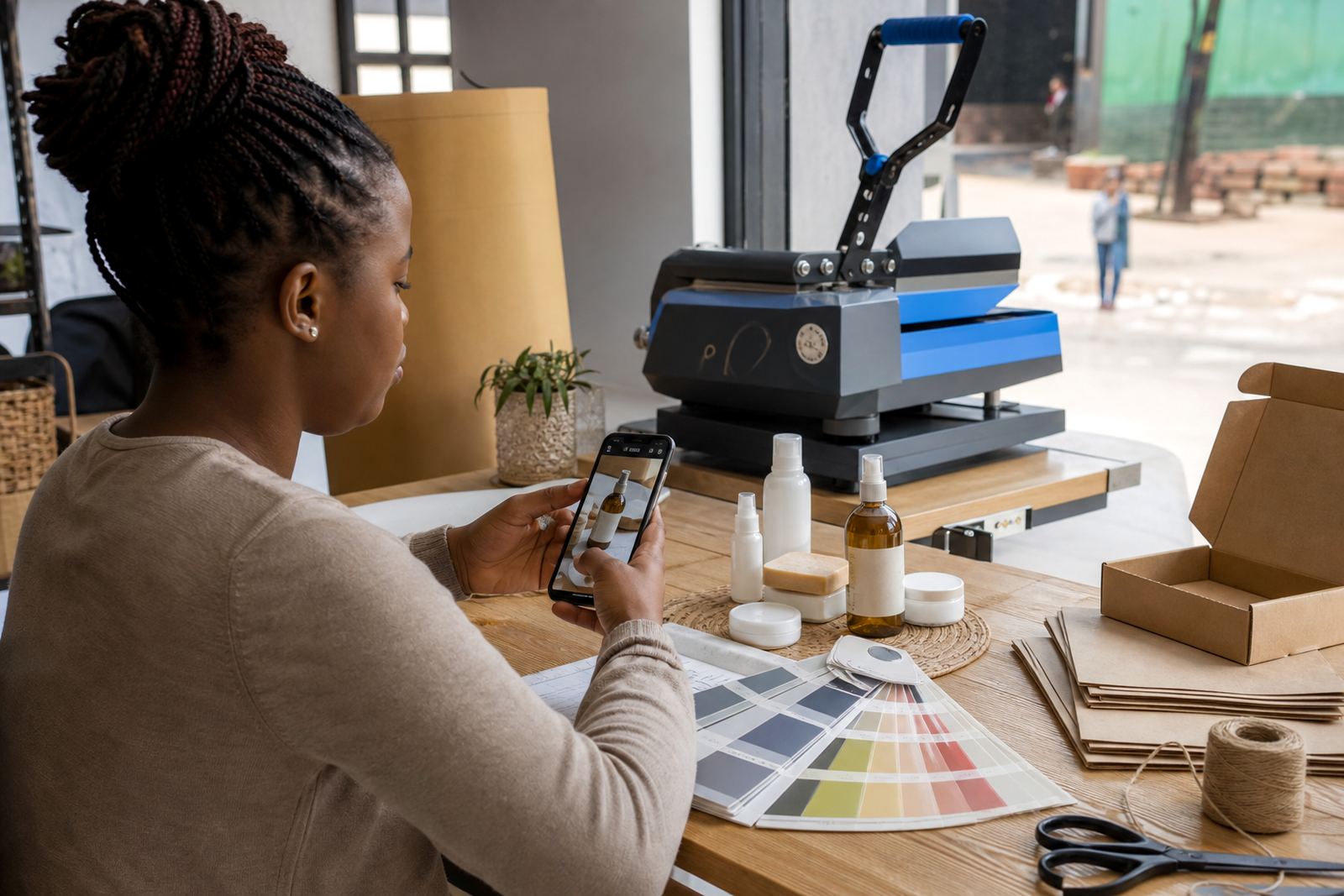
Picture quality matters. A dim photo taken in a hurry can make even good stock look untidy. Natural light helps, and so does a plain background. If you take the photo indoors, stand near a window and avoid harsh shadows. If you photograph products outside, make sure the background does not show too much noise from the street or yard. A banner should feel calm and easy to read, not busy.
For traders in Soweto and Tembisa, this can be as simple as using a clean wall, a folded cloth, or a tidy table with products arranged in rows. You do not need a studio setup. You do need a photo that looks honest and neat. Customers notice when a shop presents itself with care, and that often carries over to the rest of the order process.
- Use one main image instead of many small ones.
- Crop out bottles, cables and clutter at the edges.
- Keep product colours true to life.
- If the image is too dark, retake it rather than trying to hide it with heavy edits.
Match the name and banner to the pages inside the shop
A store name and banner work best when they line up with the rest of your online shop. If your banner says fresh meals but your product list is mostly pantry items, customers may feel unsure. If your name looks formal but your pricing page is messy, the shop feels uneven. The cleanest stores keep one tone across the name, banner, product photos and pricing pages.
This is where simple wording helps. Your product categories, WhatsApp order details and delivery notes should feel like they belong together. A customer should not need to guess whether they are in the right place. If you are selling from a home business in Pretoria or from a small trading point in Gqeberha, the layout should still feel straight forward and easy to use.
- Use the same spelling of your store name everywhere.
- Keep the banner message in line with the products you actually sell.
- Make sure the banner style suits your product photos.
- Check that your shop name is easy to read on both small and large screens.
When everything matches, customers spend less time trying to work out the shop and more time choosing what to order. That is important for traders who need a page that works well on a basic phone, a busy data connection, or during load-shedding when people are checking later by candlelight and mobile data. The shop should still feel clear when opened quickly.
A local example from a small shop in Soweto
Take a small trader in Soweto selling fruit, bread, airtime and household basics. A name like that does not need to be clever. It can be short and direct, with a banner that shows the shop name and one line such as daily essentials and local delivery. The products then speak for themselves through clear photos and priced listings. There is no need to over explain.
Now compare that with a banner full of fancy wording, a long store name, and a background image that hides the text. The first shop feels organised. The second shop feels like work. Customers in Johannesburg, Alexandra or Johannesburg south are usually looking for speed and confidence. They want to know what you sell, how much it costs and how to order, with no guessing.
A strong local example is a trader who changes an old, unclear banner into a cleaner one with one product image, one clear heading and a visible area name. The store suddenly feels easier to trust. That does not mean it is perfect, just easier to use and easier to remember. Small changes can make the page feel much more practical.
Keep it readable, then check it on a phone
Before you settle on a store name and banner, look at them the way a customer will. Open the page on a phone, not only on a computer screen. Check whether the text is readable without zooming in. Check whether the image still makes sense when it is smaller. Check whether the name sounds natural when you say it out loud. These small checks save time later.
It also helps to ask someone nearby to read the name and tell you what they think the shop sells. If they are unsure, the wording may need work. A good banner should give a quick answer, not a puzzle. For many informal traders, that one glance is the difference between a customer staying on the page or moving on to another seller.
At SellThat, the aim is to help traders set up an online store that feels simple to use and easy to recognise. That starts with the name and banner. Keep both practical, keep both neat, and let the rest of the store do the selling.
- Read the store name aloud to hear if it sounds natural.
- Check the banner on a small screen before going live.
- Keep the message short enough to fit neatly over the image.
- If in doubt, choose clarity over decoration.